We’ve recently added fields from “Trade book” and “Order book” to help you gain deeper insights into how they impact the price. Below is the list of new fields added:
Trade book fields:
The below fields can be accessed across all timeframes, starting from 1 minute to a yearly timeframe
-
- Buyer-initiated trades – Indicates the number of trades that were executed at sellers/offer/ask price; an increasing number would indicate buyers are more aggressive than sellers.
- Buyer-initiated trades quantity – Indicates the number of trades that were executed at sellers/ask price; an increasing quantity would indicate more number of shares are being bought at a price as requested by sellers.
- Buyer-initiated trades average quantity – Indicates the average quantity of trades for “buyer-initiated trades.”
- Seller-initiated trades – Indicates the number of trades executed at a buyers/bid price; an increasing number would indicate sellers are more aggressive than buyers.
- Seller-initiated trades quantity – Indicates the number of trades executed at a buyers/bid price; an increasing quantity would indicate more shares are being sold at a price as requested by buyers.
- Seller-initiated trades average quantity– Indicates the average quantity of trades for “seller-initiated trades.”
- Buyer vs. Seller initiated trades ratio – A ratio of “buyer initiated trades / seller initiated trades” above 1 indicates that buyer-initiated trades are more than Seller for the given timeframe
- Buyer vs. Seller initiated trades quantity ratio – A ratio of “buyer initiated trades quantity / seller initiated trades quantity” above 1 indicates that the buyer-initiated quantity of trades is more than the Seller for the given timeframe.
- Buyer-initiated trades VWAP – Volume weighted average price (VWAP) of trades that buyers initiated.
- Seller-initiated trades VWAP– Volume weighted average price (VWAP) of trades that sellers initiated.
These fields can be used to evaluate trades for intraday, short or long-term, as they are available across all timeframes. There has been limited research on these fields, as their availability is limited, considering the amount of data that needs to be processed for these. Here’s one interesting research paper on this.
Order book fields:
The below fields can be accessed across all timeframes, starting from 1 minute to a yearly timeframe
-
- Orders – Indicates the orders received for the specified timeframe, e.g., total orders within a minute
- Orders Quantity – Indicates the number of orders received for the specified timeframe, e.g., total order quantity within a minute.
- Buy Orders – Indicates the “Buy orders” received for the specified timeframe.
- Buy Orders Quantity – Indicates the “Buy order” quantity received for the specified timeframe.
- Sell Orders – Indicates the “Sell orders” received for the specified timeframe.
- Sell Orders Quantity – Indicates the “Sell order” quantity received for the specified timeframe.
- Buy vs. Sell orders ratio – A ratio of “Buy orders / Sell orders” above 1, indicating buy orders are more than sell orders.
- Buy vs. Sell quantity ratio – A ratio of “Buy orders quantity / Sell orders quantity” above 1, indicating buy order quantities are more than sell order quantity.
- Canceled Buy Orders – Indicates the total orders canceled in the specified timeframe.
- Canceled Buy Orders Quantity – Indicates total buy orders quantity canceled in the specified timeframe.
- Canceled Sell Orders – Indicates the total sell orders canceled in the specified timeframe
- Cancelled Sell Orders Quantity – Indicates the total sell orders quantity canceled in the specified timeframe
- Total Cancelled orders – Indicates the total orders canceled in the specified timeframe
- Total Cancelled orders quantity – Indicates the total order quantity canceled in the specified timeframe
- Canceled orders ratio – A ratio of “Cancelled orders / Orders” gives an idea of the pie of orders being canceled from the ones received
- Canceled orders quantity ratio – A ratio of “Cancelled orders quantity / Orders quantity” gives an idea of the pie of orders quantity being canceled from the ones received
- Buy Orders Vwap – Volume weighted average price (VWAP) of buy orders.
- Sell Orders Vwap – Volume weighted average price (VWAP) of sell orders.
- Orders Vwap – Volume weighted average price (VWAP) of all orders.
The order numbers indicated above are the actual orders(not disclosed) for the cash market & hence the values will not match with the market depth seen within your broker’s terminals, which helps get a much clearer picture of how this is driving the price of a stock.
These new fields can be combined with existing functions, e.g., SMA, Min, Max, Count and so on.. to derive onto more complex indicators.
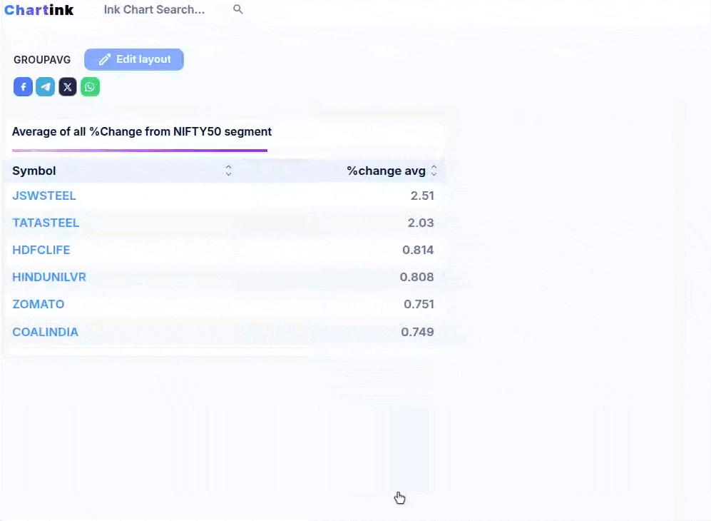
Sample dashboards
Buyer vs. Seller initiated trades
While we are working on adding more scans & dashboards for the same, I wanted you to be updated on adding these new fields. HI hope these are useful for gaining more insights along with the existing fields of technical analysis.